As Kansas City gears up to take on the Philadelphia Eagles in the Super Bowl, city officials are ushering even more change — by adopting a new municipal flag.
The new flag will be a fresh symbol for Kansas City before it opens a new airport terminal and hosts the 2023 NFL Draft later this year.
Kansas City Council voted 10-1 to approve the new design at Thursday's meeting.
“I am proud to see the update of our official Kansas City flag, which encapsulates Kansas City as the Heart of the Nation, recognizes our heritage as the City of Fountains, and represents the kind hearts and welcoming nature of Kansas Citians, ” said Mayor Quinton Lucas in a statement. “As our city sees tremendous growth and success in recent years, I look forward to our flag being a widely recognized symbol of our community for all.”
Ted Kaye, a flag expert and secretary of the North American Vexillological Association (FYI: vexillology is the scholarly study of flags) says that while he can’t speak for the organization as a whole, he thinks Kansas City’s current flag is in need of a refresh.
“It's important to remember the basic purpose of a flag, which is signaling at a distance. You want to be able to recognize the flag and identify it,” says Kaye. “You want to be able to make it out and remember what it represents. And the current flag with all of its white space doesn't do that.”
The current flag isn't very good

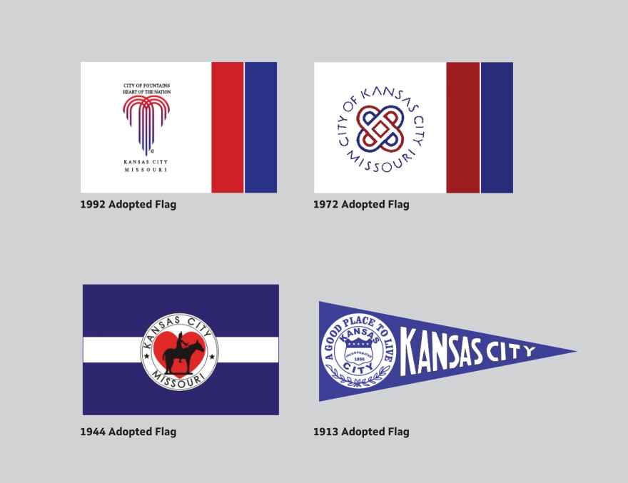
Kansas City’s current flag was adopted in 1992 and then unofficially amended in 1995.
Kaye — who has compiled a guidebook called “'Good' Flag, 'Bad' Flag: How to Design a Great Flag” — says that current flag breaks a lot of rules. For one, the wording is next to impossible to read, and the fountain is washed out by the white background.
Kaye says Kansas City has changed its official flag a lot of times compared to other cities.
“When we wrote the book 'American City Flags' in 2004, which covered 150 American city flags, Kansas City had had more flags in its history than any other of the 150 flags surveyed,” says Kaye. “The current flag is the fifth flag since the pennant adopted in 1913.”

But is the new flag better?
The design process for the new flag was lead by Kansas City’s creative director Jared Horman, with contributions from city communications director Melissa Kozakiewicz and members of the communications team.
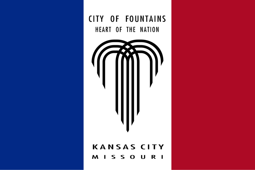
The design is reminiscent of flags adopted in 1992 and 1972. Red and blue horizontal stripes back a white fountain emblem, which is symbolic of Kansas City being the heart of the nation and the City of Fountains.
A graphic posted on Twitter by Mayor Quinton Lucas explains what the colors mean.
Just flagging. 👀 pic.twitter.com/TvXhBscDEj
— Mayor Quinton Lucas (@MayorLucasKC) February 8, 2023
“The red represents the warm hearts of the people of the Midwest and celebrates Kansas City kindness,” the graphic says. “The blue represents the city from river to sky. Blue celebrates the relationship with the Missouri River and the expansive possibility of prosperity.”
This new flag though, provided city officials approve it, adheres to the five basic principles of flag design: simplicity, meaningful symbolism, has two to three colors, no letters or seals, and is distinctive.
In Kaye’s opinion, though the fountain symbol could be a little more stylized, the new design is easy to read and has the potential to be easily recognized as a symbol of Kansas City.
He says although the fountain emblem will need some sort of explanation, that’s common. The symbols on even some of the most recognizable flags — like France, Japan, or Canada — aren't immediately obvious either.
“You need to have it explained to you. But once it's explained to you and you, you can remember meaning in it, and you can recognize it at a distance, it's a successful flag,” says Kaye. “And I think this new proposed flag will have that effect.”
New flag who dis? pic.twitter.com/hvzMEHggIp
— Kansas City (@KansasCity) February 9, 2023


