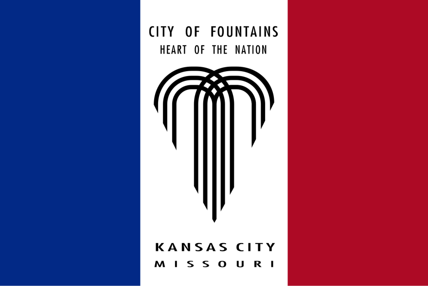
At our recent Podcast Party we asked Kansas City to redesign our city's flag.
Our inspiration was a very popular episode of the podcast 99% Invisible called "Vexillonaire" (a play on vexillology, or the study of flags).
In the episode Ted Kaye of the Portland Flag Association details the principles of flag design, according to the North American Vexillological Association. Those guidelines are:
1. Keep it simple.
2. Use meaningful symbolism.
3. Use two to three basic colors.
4. No lettering or seals of any kind.
5. Be distinctive
You'll notice that Kansas City's flag breaks two of those rules — words are a no-no and our flag looks a little French, wouldn't you say?
So for the sake of fun and city pride, everyone at the Podcast Party redesigned the flag and now you get to pick your favorites.
Thank you to everyone who threw their flag into the ring. To make voting as easy as possible, KCUR employees narrowed down the field a bit and now you get to pick your 3 favorites. To vote, follow this link.
The winning flag will be printed at All Nations Flag Company in the River Market and displayed at KCUR's studio.
It's your turn to go vote right now. Help us choose a flag that better represents your love for our great city.
Kyle J Smith is a digital intern at KCUR. You can find him on Twitter @kjs_37.


